Research Methods — Week 2
Last week:
This week: how to summarise and visualise data — and how to tell whether a number is big or small.
Submit questions anonymously:
PollEv.com/geol
text geol to 07480 781235
🎓 Concept block 1
Compress thousands of numbers into a few useful ones.
Three questions about any dataset:
The “balance point.”
Sensitive to extremes.
Pull one value way up → mean shifts.
The middle value.
Robust to extremes.
Pull one value way up → median barely moves.
When do they differ? When the distribution is skewed.
Spread matters as much as centre. A mean of 10 with SD of 1 is very different from a mean of 10 with SD of 50.
Symmetric
Mean ≈ median.
Many natural processes.
Skewed
Mean ≠ median.
Income, grain size, ore grades, permeability.
Always look at the distribution, not just the mean.
💬✏️ Exercise 1
UK biomass electricity: 38 TWh/year.
Big or small? Compared to what?
Total UK electricity is ~320 TWh. So biomass ≈ 12%.
Drax power station emits 12 Mt CO₂/year.
UK total CO₂: ~340 Mt. Drax is ~3.5% of the national total — from one building.
A single wind turbine produces about 6 GWh/year.
A UK household uses ~3,500 kWh/year. One turbine ≈ 1,700 homes.
Every time you see a number in this module, ask:
And its companion: “Compared to what?”
🎓💻 Concept block 2
You’ll practise spotting these in a moment.
🖥️ Switching to WebR
Data + Aesthetics + Geometries = a plot.
Everything in ggplot2 follows this pattern.
✏️ Exercise 2
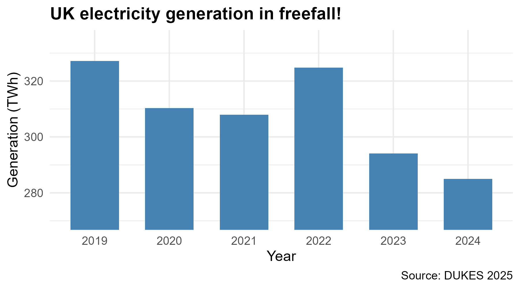
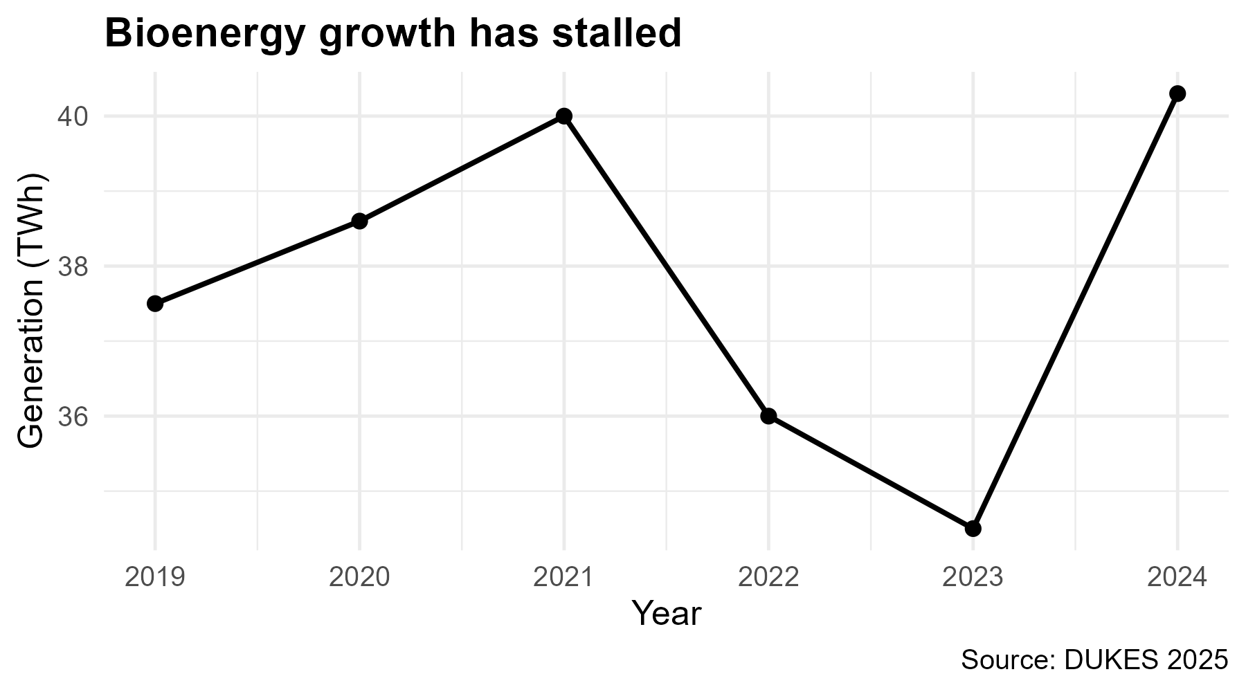
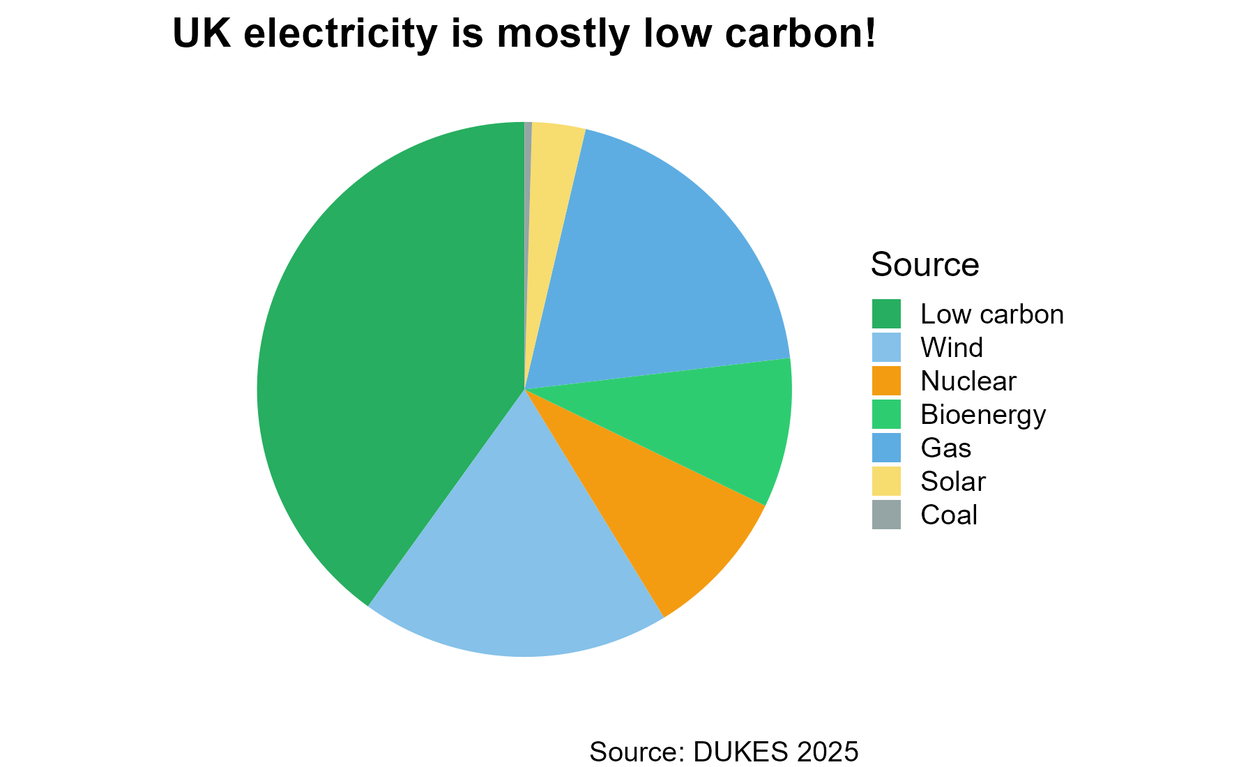
I’ll show you some deliberately misleading charts.
For each one: what’s wrong, and how would you fix it?

Fix: Start the y-axis at zero for bar charts. The visual area encodes the ratio, so a non-zero baseline distorts the comparison.

Fix: Show the full time range. Bioenergy grew from 4 TWh (2000) to 40 TWh (2024) — a tenfold increase hidden by this window.

Fix: “Low carbon” double-counts Wind + Nuclear + Solar + Bioenergy. Slices sum to 156%. A pie must represent parts of a whole.
🎓 Concept block 3
A histogram shows you what the mean and SD cannot:
The familiar bell curve. Appears when many small, independent effects combine.
Central Limit Theorem (informally): averages of large samples tend toward normal, even if the underlying data aren’t.
This is why so many statistical tests assume normality — and why they often work even when the raw data are messy.
Many geological measurements are log-normal: skewed right, with a long tail of large values.
When data are log-normal, the mean can be very different from the typical value.
If your data:
Then log() often makes them more symmetric and easier to analyse.
✏️💻 Integrative exercise
Open WebR. Using the biomass data:
This is a check that you’re comfortable with ggplot2 syntax before the application session.
UK biomass electricity output was 37 TWh in 2024. A classmate says: “That’s a lot — it must be making a real difference.”
What’s the most important question to ask first?
PollEv.com/geol
text geol to 07480 781235
Application session: “Making the biomass case”
You’ll produce the figures that will go into your briefing.