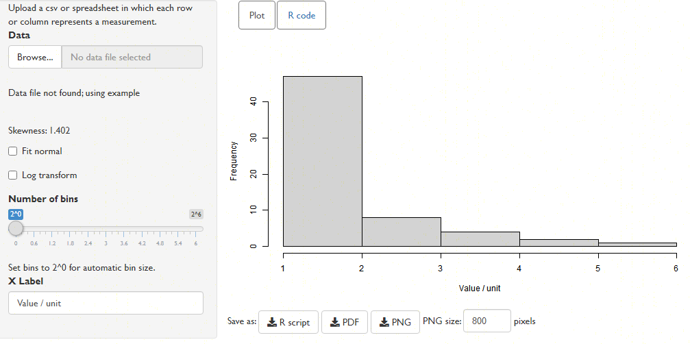
Now we're going to explore some of the quantitative indices of
diversity, to see how they measure up against the intuitive
assessment that you just made.
Look at the diversity indices for each assemblage, displayed
beneath the bar plot.
-
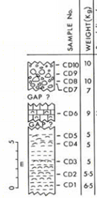
Rank assemblages CD5–CD7 from least to most diverse, based on their
Species richness (S).
-
-
Least diverse
- CD7 (S = 8)
- CD5 (S = 14)
- CD6 (S = 15)
- Most diverse
-
Do you think that this metric is a reliable measure of diversity?
-
Hint: look at the number of individuals sampled in each assemblage.
-
n is tiny in CD7, and huge in CD6.
Clearly, when n is very small relative to S,
you are not going to sample every species that is present.
It is going to take a very large sample indeed to observe
the rarest species.
-
Have a go at devising a formula that will allow the
species richness of two assemblages, each containing a very
different number of individuals, to be compared.
-
Getting the "right answer" is not important here: I'm interested
in your thought process.
-
To backstrip the effect of sampling intensity (n) on
S, you need some concept of how many more rare species you
will happen to see as you sample more individuals.
You can then 'shrink' S by this function of n.
The next section gives two widely used approaches. Neither is "correct" – the 'right' approach for a specific situation is somewhat unknowable.
Richness indices
Menhinick’s and Margalef’s
richness 'indices' are two attempts to normalize the number of species
observed based on the number of individuals sampled.
The two approaches differ in their concept of how many more
'rare' species we expect to see as we sample more individuals:
Menhinick's (S / √n) posits that
the number of species increases with the square root of
the number of individuals sampled;
Margalef's ((S – 1) / ln n) that S
should increase with the logarithm of sample size.
Empirically, which is a better model seems to vary from
assemblage to assemblage, so neither is necessarily “better”.
-
How does each approach order the three assemblages?
-
- Menhinick’s richness: Least diverse _6_ / _5_ / _7_ Most diverse
- Margalef’s richness: Least diverse _5_ / _6_ / _7_ Most diverse
-
Does it matter which you choose to calculate?
-
It looks wise to calculate both: if different indices suggest
different rankings, then perhaps it's worth pondering whether
sample size is affecting your results, and not putting
too much weight on rankings that disagree.
-
The coloured bars beside each value contextualize the value, where
a zero-width bar represents minimum richness, and a full width bar
maximum richness. Notice that despite their very different absolute
values, Menhinick and Margalef's measures always sit in a very
similar place in their respective ranges.
Dominance indices
Now let’s consider how we might measure dominance.
It's a good idea to measure this using an index:
mathematically, an index is a dimensionless value that ranges from
zero to one. In this context, a value of one should denote
maximum dominance; zero, maximum evenness.
The simplest measure, and the one that you are perhaps most likely
to encouter, is the Berger–Parker index. The BPI is the
proportion of the n individuals that belong to the most
common taxon (nt) –
i.e. nt / n.
Worked example:
Species A: 5 individuals
Species B: 15 individuals
Species C: 10 individuals
Species D: 10 individuals
n = 5 + 15 + 10 + 10 = 40 individuals
Most common taxon = Species B (15 individuals)
nt = 15
BPI = nt / t = 15 / 40 = 3 / 8 = 0.375
-
Consider two assemblages, A and B. A has a dominance index of
0.25. B has a dominance index of 0.25. Which is more dominated?
-
This is a somewhat mischevious question. Answer it anyway...
-
You would expect that both assemblages would be equally dominated,
and not particularly dominated at that (i.e. rather even).
If that's not the case, then you might want to ask hard questions
of the supposed 'index'.
-
Consider an assemblage that contains 48 individuals and four species.
What is the range of possible values that the Berger–Parker
index can take?
-
Hint: Consider two scenarios: one where an assemblage is maximally dominated, one where it is maximally even.
-
- Create a file containing these two assemblages,
and load them into the Diversity viewer, to check your answers.
- Set up a spreadsheet that will calculate the BPI as you
edit the number of individuals and number of species,
then play with the figures to see how the BPI changes.
-
Maximum is obtained when: n1..4 = 45, 1, 1, 1.
nt / n = 45/48 = 15/16 ~ 1
Minimum is obtained when: n1..4 = 12, 12, 12, 12:
nt / n = 12/48 = 1/4 ≫ 0
-
More generally, what value does the Berger–Parker index take in
an assemblage of n individuals that has perfect evenness
(i.e. minimum domination)?
-
You may need to express this value in terms of the species richness
S.
-
n / S < nt <
(n − S),
so
(n / S × 1 / n)
= 1 / S ≤ BPI < 1
-
Do the Berger-Parker index values for each assemblage match up
with your evaluation of their relative dominances?
Do you intuitively agree, based on the graphs, that assemblages
CD6 and CD7 have very similar dominances?
-
BP{CD6} ~ BP{CD7} ~ 0.47.
But BPmin{CD6} = 1/15 = 0.06; BPmin{CD7} = 1/8 = 0.125
So BP{CD6} is further from its minimum value than BP{CD7}!
-
Now's a good time to revisit those two assemblages with a BPI of 0.25.
What else do you need to know about the assemblages to work out
which is more dominated?
How useful is the BPI as a measure of dominance?
-
The BPI is not an index: it does not really vary from zero to one.
To interpret the BPI, you really need to know S, and you
probably want to know n too.
Is it just me, or does the BPI seem to complicate,
rather than simplify, the interpretation of an assemblage?
-
To mitigate these effects, I've added an option in the Diversity
app to correct visualization of the BPI and related values for
sample size effects, such that a zero-width bar corresponds to the
lowest possible value, and a full-width bar corresponds to the
highest.
Use the "Correct range for sample size" tickbox to see how much
difference this makes in practice – what properties characterize
the most-affected assemblages?
Simpson Index
Did you notice in your calculations that the Berger–Parker index only
incorporates the dominance of the most abundant taxon?
It doesn't seem right that these two assemblages would be considered
equally dominated:
| Species: | A | B | C | D | n |
| Assemblage X: | 25 | 25 | 1 | 1 | 52 |
| Assemblage Y: | 25 | 9 | 9 | 9 | 52 |
The Simpson index of dominance addresses this concern.
It is given by Σ pi², where pi
is the proportion of individuals belonging to taxon i.
-
What are the Simpson indices of these two assemblages?
-
X: 0.46; Y: 0.32.
Does this agree with your intuition as to which was more dominated?
-
What range of values can this index take for an assemblage with
S species?
-
1 / S ≤ D < 1 (again)
Shannon entropy / Equitability
The Shannon entropy, given by –Σpi ln pi,
is a related but more pleasing measure of dominance.
Entropy reflects how likely you are to win a bet on what species the
next individual to be sampled will belong to – in a dominated
community, a bet on the dominant species will usually pay out.
Entropy is a measure of information (the average information content
of an outcome), measured in non-arbitrary units
(bits – the same unit of data that measures your broadband speed).
As such, this is the only measure that has any objective meaning.
With some simple maths, this can be normalized to run from 0
(entirely dominated) to 1 (maximum evenness); this is reported as
the Equitibility (J).
-
How do these three metrics of dominance compare with one another, and with your intuition, for the three assemblages?
-
J ranks 5 < 6 < 7.
Does this match the ‘intuitive’ order you sketched on the diagram earlier?